Thursday, December 16, 2010

Hiker's Companion playing cards are here!

10 months of work to get the drawings ready for this deck. I think it turned out great. Thanks toInkstone Design, Inc. for selecting me for the illustrations.
Here is a link to the product page on my website: http://www.richadamsphoto.com/Drawings/PlayingCards.html. They’re available for $12.95 and are shipping soon!


Wednesday, December 8, 2010

Yellowstone Drawing Workshop - June 2011!

I'm excited to announce the return of Mike Sibley (my friend and mentor) to Yellowstone for a drawing workshop in June of next year. Some details include:


Dates:       12th -17th June 2011
Duration:  6 days, 10 am to 5 pm
Location:  Holiday Inn, West Yellowstone, Montana

  • Illustrated talk by a Park Ranger so we know what to expect and look out for during our visit to…
  • A full day in the Park with assistance on photography, taking that unusual but useful shot, and looking for elements that can be combined into a useful setting. And we provide transport and lunch.
  • Improve your photography – late afternoon sessions by talented Artist and Photographer Rich Adams beginning with the basic uses of compact cameras.
  • Visits to the nearby Grizzly & Wolf Discovery Center to get those photographs that eluded you in the Park.
  • Five days of uninterrupted drawing covering drawing from the basics up to advanced.
  • AND all tools and paper will be provided. Just bring yourself.
To find more details and to sign up for the workshop, please head on over to Mike's website:

This workshop is limited to just 25 artists to ensure individual attention, so head over now to the workshop page and fill in the “Keep Me Informed” details to make certain of receiving the newsletters.

I'll be posting more details on the workshop and what to expect as an attendee over the winter.

I hope to see you there!

Monday, November 1, 2010

Dinosaur Sketch


My wife and I attended the Montana Festival of the Book over the weekend and attended Jack Horner's presentation about his newest book How to Build a Dinosaur. I had my Moleskine journal with me so I started doodling one of the dinosaur images at the beginning of the presentation and was able to finish this small sketch before the presentation was completed. He was kind enough to sign my drawing along with my wife's copy of How to Build a Dinosaur. It's always a treat to meet an author we especially like and we found that Dr. Horner was a very approachable and patient person.

I had been lucky enough to attend a symposium in Bozeman, Montana (the home of the Museum of the Rockies, where Horner is curator) and listened to another presentation for the Guild of Natural Science Illustrators before leading us on a field trip to the Museum of the Rockies where we were given a behind-the-scenes look at the efforts that go into creating and preserving the many exhibits at the museum.

It was one of those experiences that makes you say, "If I ever got the chance to work here, I would be in heaven." Unfortunately I don't know how to weld, have never cast a bone in a silicone mold, haven't created exhibit displays where the specimen can be removed for study and reinserted without causing damage to the display or, more importantly, the bones themselves. Needless to say, I'd need a few more qualifications which is why their current exhibit coordinator is so unique. It's a great museum and well worth the visit if you even happen to be in Bozeman before traveling down to Yellowstone National Park.

Thursday, October 28, 2010

New drawing completed: Raven Study


Just in time for Halloween, here is a link to my web page with a recently completed drawing of a Raven. I tried to play around with the graphical elements of the raven to produce a dynamic pose even though he’s perched on a static limb. By spreading the feet, lowering the center of gravity and stretching the neck out just a bit, I hope it imparts a feeling of potential action that I was going for.


The print is available in both 11×14 and 16×20 frame sizes and printed on 100% cotton rag fine art paper with pigment-based archival inks.

Plans for our basement renovation

I’ve been working on the plans for our basement remodel for the last couple of weeks. I ran across a great application by Google called SketchUp. It’s a great application to create 3-dimentional models and it’s FREE! It took a bit to learn the application and I would highly recommend anyone interested to view all of the online tutorials before diving in.


Our basement is partially finished and we’ve been making due with cold concrete  and really inadequate lighting for quite a while. Our new plans will involve the finishing of two separate rooms, one a smaller bedroom that we’ll use for framing and matting and a large common room (shown below) that we’ll divide into an area as an indulgent reading room along with a separate office / studio space for myself. I’ve included some images from the SketchUp program showing our current plans.

Wednesday, October 27, 2010

Raven Study study

I hope you'll excuse the quirky title for this smaller sketch. I am nearly finished with a raven drawing that I've been working on for the last couple of weeks. It's taking me so long because we are beginning the process of remodeling our basement and I've been developing the architectural drawings for the contractor. I'll try to create a separate post to talk more about this process.

Turning to the sketch, the first thing I'll comment on is the paper selection. I am a paper nut and have a large 14"x17" portfolio packed with numerous different papers (I believe there are 15 or more different papers in this single portfolio and I have another!). I use different papers depending on the subject, the size of the piece, or simply my mood for that day. This is one of those times when I went back to a paper that I seem to be drawn to whenever I really just want to have fun drawing a piece -- Arches Hot Press watercolor paper. I use the back side of the paper which lacks the laid pattern of the front side. It's a wonderful paper for pencil drawing because it's quite robust, allowing the artist to erase lines, lighten previously drawn areas, or simply scrub in some really beautiful darks.

The reason I selected this paper for the raven was that it allows an extremely wide contrast range and also allows me to create some intricate details at a fairly small scale. It seemed to work pretty well for this piece.

I am going to really try to use Arches more often as I really like the results I can obtain with it and it feels a lot more like sketchbook or drawing paper than bristol board. It's a little finicky with hard grades (2H or harder) but if you use a dab of blending with a tortillion occasionally, you can avoid having to use extremely hard pencils.

Tuesday, October 19, 2010

Currently reading...

A Short History of Nearly EverythingA Short History of Nearly Everything by Bill Bryson


Extremely accessible, appropriately amusing, and very informative. I am really enjoying the book and can say that Bill Bryson's understated wit is very engaging.


View all my reviews

Monday, October 11, 2010

How To: Dog's Eye Tutorial

One of the most common questions I receive at shows is “How do you draw an eye?” usually followed by “…and make it look real?”

Well, there’s a long answer which would involve talking about reflectivity versus absorption, varying textures, pencil grades, layers, etc., and then there’s simply showing what I mean step-by-step. This post will attempt to explain the process by walking you through a 15-minute drawing and how I go about drawing eyes.

Thursday, October 7, 2010

Results from our new panini grill

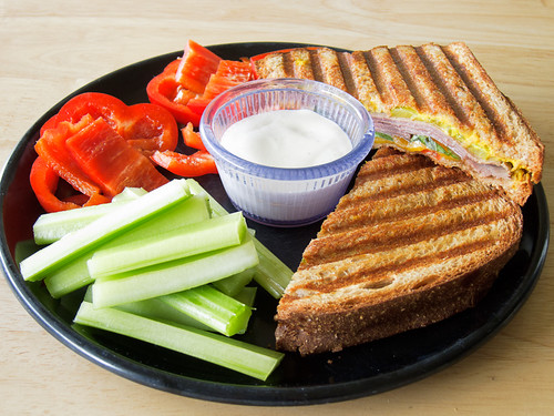
We just purchased a new panini grill and here is the first sandwich prepared on it. It's a roast beef and cheddar with red bell pepper and basil. I think we'll keep it! :-D


Tuesday, September 28, 2010

REVIEW: Canson's XL Recycled Bristol pads

In our age of increasingly bottom-line driven business strategies, it's a delight to come across a company interested in doing things right. I recently came across a new paper by Canson while surfing online and became curious about it's specifications. I've used seven other types of Canson paper and really like their consistency, versatility, and quality (Canson Field Sketch, Canson Field Drawing book, Canson Student Bristol Smooth and Vellum, Canson 2-ply Bristol Smooth, Canson 2-ply Bristol Art Board, Canson Pure White Drawing Art Board, and Canson Illustration Art Board).

This new paper is Canson XL™ Recycled Bristol. It's a 96 lb (260 gsm) stock, is bright white, and according to Canson, is the first recycled two-sided paper (vellum on the front side and smooth on the back).


I've never used a recycled bristol board and my main concerns were the archivability and whether it contained optical brighteners. As a quick explanation, archivability is critical to ensure long-term preservation of paper-based art. It's simply non-negotiable for my work. An acid-free paper will resist yellowing and when properly matted and framed, will remain in great condition and lasts more than a lifetime (and sometimes several).


Optical Brighteners (OB's) are often used in recycled paper to bleach the pulp and make it more pleasing to look at. It's not inherently bad but it can have detrimental long-term effects for artwork because it can change subtly over time, most often dulling unevenly. It's a bigger issue with printer papers but can be found in fine art papers as well.


With these concerns in mind, I sent off an e-mail to Canson hoping someone might be able to answer my questions. I must admit that I had very low expectations that someone might respond. Interactions with other paper suppliers have provided some convincing evidence that their salespeople don't actually know a heck of a lot about paper. Well, I can state definitively that my fears were completely unfounded. I received a a detailed and thoughtful response from Michelle R. She not only answered my questions directly and with clear knowledge of the paper manufacturing process, she went well above and beyond by offering to send a sample of the paper so I could try it out. I was simple stunned.


The First Tests:
I'm happy to report that the paper is even better than I had hoped. I've included a couple of small sketches from each side of the paper. These are 200% enlargements so the grain is much more visible than in person.


First the Smooth (back) Side:


and the Vellum (front) Side, which has a nice tooth for tonal drawings.

I can see applications for both sides of this paper. It is easy to scan, erases well, and is resilient enough to allow you to fine tune details and tones until you get them just right. Dual-sided papers can sometimes be a bit lacking in versatility because the manufacturing process doesn't have the same standards on each side. I would say that Canson has indeed made a truly 2-sided paper with both sides having independent and high-quality surfaces.

It will be interesting to see how the textured side responds to colored pencils. I would imagine it would be a great surface to accept numerous layers and being bright white should make the colors pop off the paper.

Summary
Overall I would praise the XL Recycled Bristol from Canson as a high-quality recycled (30% post consumer materials) paper. It's bright white, erases well, and is very resilient. With being acid free and lacking any added optical brighteners, it is a great choice and earns a Highly Recommended!

4 out of 5 Pencils
HIGHLY RECOMMENDED

Thursday, September 23, 2010

Photos from Glacier National Park

Moose enjoying a morning dip.
Continuing on my photo publishing kick. Here are a few from our trip to Glacier National Park.


I've posted the albums both to a Flickr album as well as another Facebook album.


I hope you enjoy them.

Wednesday, September 22, 2010

Photos from our horseback trip

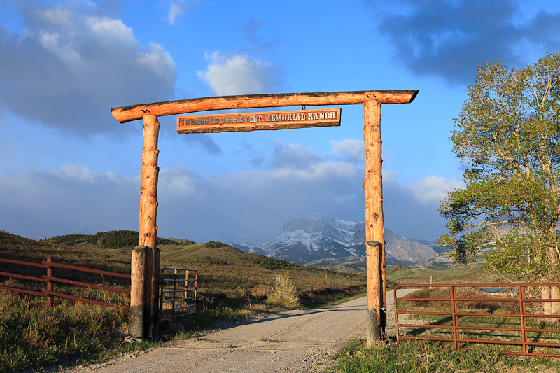
Theodore Roosevelt Memorial Ranch
I've posted photos from our horseback trip to a Flickr Album and to a Facebook Album (you have to be a friend to view these) for those with a preference for either technology.

These are from our trip to the Theodore Roosevelt Memorial Ranch in May. It's on the Rocky Mountain Front and was our first experience in that area of the state. It was tremendous and it's very likely that we may go back from a return trip.


Monday, September 13, 2010

UPDATE: Uni-ball 2.0 mm Pencil Lead Sharpener!

In my previous post, Review: Uni-ball 2.0 mm Pencil Lead Sharpener, I indicated that if you broke the lead off in the sharpener that you might have killed it. Well, I apologize that I spoke a bit prematurely. While sharpening a pencil this morning, I found that you CAN, in fact, open the sharpener to access the sharpening blade and rescue your $9.00 sharpener from a broken pencil lead. Here is how to do it.

1) Look towards the bottom of the sharpener and find the small squarish piece. There is an identical one on the other side of the sharpener. You're going to need to grasp these with your thumb and forefinger as shown in the second photo.
1) Locate the small square
at the bottom of the sharpener?
2) After firmly grasping these two squares, you're going to begin pull down away from the bottom of the sharpener, trying to slide out the inner sharpening mechanism.
2) Grip the opposing squares VERY firmly.
3) If you've got decent finger strength, you should be able to slide out the inner mechanism from the sharpener. If you need some assistance, I would recommend using the cushioned handle of a pair of  pliers to assist you. Don't use the jaws or you'll either scratch the pencil sharpener or probably break it in the process. 
3) Slide out the inner assembly.
4) Once you're able to free the sharpening assembly from the outer shell, simply remove the broken pencil lead from the sharpener being careful not to dull the sharpening blade. I typically use a wooden toothpick or if I don't have one on hand, an unbent paperclip (but be careful not to press firmly on the cutting edge of the sharpener.
4) Remove the sharpener and
remove the broken pencil lead
I hope that helps! I certainly am very glad I found this fix since it isn't mentioned in the instructions from the sharpener and I'd hate to throw away a $9.00 sharpener simply because it has a piece of graphite wedged in the blade.

I would have liked to have seen instructions (or at least diagrams, considering the directions are in Japanese) showing how to open the sharpener. It is designed so well that it's not obvious through any wobbling or gaps that the device actually opens.

I also wanted to update the score for the sharpener since it no longer has the limitation I mentioned. I've updated the previous review and will include the new score here as well.
4.5 Pencils
Highly Recommended

Friday, September 10, 2010

How To use the Staedtler 2mm tub sharpener

I have seen several people post questions about how to use a Staedtler tub sharpener to sharpen their clutch pencils. Hopefully this little tutorial might help explain how to use one.

First, we need to look at the three holes on top of the sharpener. The biggest one, is obviously where the pencil will eventually go to be sharpened. The two smaller holes, however, aren't self-explanatory. The image below shows which hole is intended for sharp points and which is intended for dull points (which I hardly ever use).


First off, we need to press the button at the back end of the clutch pencil to extend the lead out a inch and a half or so (3cm) and drop the lead into the 'sharp tip' hole. Basically, touch the bottom of the hole with the lead.
Extend the lead until
it hits the bottom

The next step is to then press the button on the back end of the pencil again and this time, lower the pencil jaws until they touch the top of the tub sharpener. You want to make sure that the pencil lead is bottomed out in the hole while you're doing this step and you aren't picking the lead out of the hole before lowering the pencil to the tub.
Drop the pencil down
until it touches the tub

The final step is to remove the pencil from the 'sharp tip' hole and insert it into the tub itself and turn the pencil around until it stops making a sharpening noise against the metal sharpening ring.

Insert the pencil into the
tub and turn to sharpen.
You're done! Hopefully this resulted in a sharp pencil lead. If not, feel free to post a comment and I'll try to help out.


Review: Uni-ball 2.0 mm Pencil Lead Sharpener

Uni-ball 2.0mm
Pencil Lead Sharpener
I recently acquired the Uni-ball 2.0 mm Pencil Lead Sharpener from JetPens.com (a wonderfully indulgent online pen and pencil store - highly recommended). I thought it might be useful to share my experiences with it for use with 2mm clutch pencils.

I typically use Staedtler Mars-780 clutch pencils, which are 2mm drafting pencils that accept a wide range of pencil grades. They are the best compromise between a mechanical pencil (e.g., 0.5mm) and a wood-cased pencil. I have long been using the Staedtler tub sharpener but find it a bit inconvenient when doing art shows for a couple of reasons. First, it is a bit bulky so I have to find a pocket to fit it into, which leads to the second issue, namely that if you tip it upside down, the graphite shavings from your previous pencil sharpenings tend to fall out and turn your drawing kit into a fingerprinting scene from CSI.

Isn't it cute?
The clever rotating
cap design
In an attempt to resolve these two issues, I picked up the Uni-ball pencil lead sharpener. It's quite a cute little device. Made of medium-grade plastic, it has a wonderfully ergonomic design. There are no sharp edges or projections to catch on pockets or clothing so it can be slipped into a shirt pocket or even thrown into a pencil case along with your other supplies.

The mechanism is quite simple and basically allows you to sharpen any type of clutch pencil by simply extending the lead into the hole and turning clockwise. Unlike the Staedtler tub sharpener, it doesn't require the lead to be extended to a specific length.


I've included some shots to the right of the sharpener in use to give you an idea of its size - one word, it's small. Very handy but quite a bit smaller than you might imagine given the product shots.

There is one drawback to an otherwise perfect little sharpener. The  price. At $9.00 USD, it's simply too expensive to make it a simple solution for most casual pencil users. I draw 5 hours every day so this is sort of a no-brainer for me, especially when I'm at shows. But for those who are casual users, this is most likely too high.

If you happen to break the lead off in the sharpener, see my post on how to rescue your sharpener!

Overall, this sharpener earns 4.5 out of 5 pencils, and is highly recommended for those not on a tight budget and who don't abuse their pencil sharpeners. I would recommend purchasing this sharpener through JetPens.com but be forewarned, you might end up spending a lot more than you planned after browsing through their selection!

4.5 Pencils
Highly Recommended

Thursday, September 9, 2010

A sketch tribute to J.C. Leyendecker

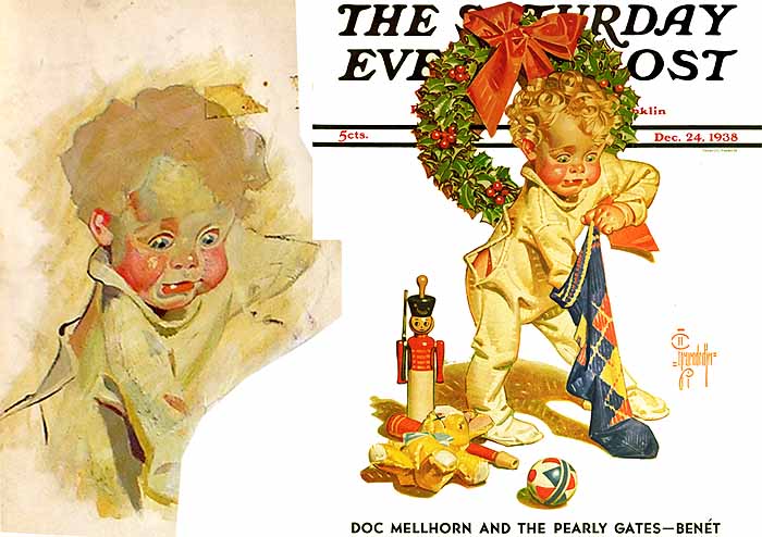
Sketch from J.C. Leyendecker painting
James Gurney posted a great overview post of J.C. Leyendecker's drawing process. After looking over some of this basic technques, I was truly impressed by how confident Leyendecker's approach appeared on canvas. His strokes are purposeful yet organic. A rare combination, found only with the true masters. I took it as a challenge to create a sketch of his  little boy portrait included in Gurney's post.

The aspects of the painting that really stood out the most to me were the wonderfully bold line work in the painting. There's no doubt that he is a master illustrator and understood the importance of clarity of form. But the other aspect was the beautiful way he captured the reflected light along the cheek, lips and nose in the painting. It really speaks to his knowledge of lighting and his emphasis on keeping things bold yet simple.

I wasn't very familiar with Leyendecker's work, but Gurney's post really makes me intrigued with his techniques. I found a wonderful online portfolio of his sketches and studies for some of his Saturday Evening Post cover pieces. This one made me chuckle aloud...

Tuesday, August 17, 2010

A couple of new commissions recently completed

Here are a couple of commissioned drawings that I recently completed. It's been quite a while since I had time to work on some commissions but those familiar black labs that are so common around Missoula have made their reappearance. These two dogs were owned by the same family, Kodak (the first dog) is owned by the mom and Oak (the second) by the daughter. They are a wonderful family and were so understanding about the long delay in getting the drawings completed.

I should hopefully be delivering them sometime this week and am eager to see their reactions to the completed drawings. My wife is doing the framing and is putting her well-developed skills to the test with these two pieces.

I used two different papers for these commissions, the first was done on Canson's wonderful Artboards (bristol plate version) and the second was on my tried and true Strathmore 400 Series Bristol Smooth. Both dogs are around 7.5" x 10" on the page. I will try to post some photos of the framed pieces once they're completed.

Tuesday, July 27, 2010

Wednesday, July 21, 2010

Why I keep a sketchbook

There are a lot of reasons to keep a sketchbook and I wanted to offer my approach and what its benefits are to me as an artist.

First off, I wasn't always a sketcher. In fact, it wasn't until about 2 years ago that I started keeping a sketchbook and using it on a regular basis. I sketched infrequently, usually when bored and I never had a clear goal of what I was trying to accomplish when I did sketch. That changed two years or so ago when I decided to get "serious" about sketching.

What type of sketchbook?
People prefer different kinds of sketchbooks but for me, a spiral-bound sketchbook is my favorite. It offers two advantages that a book bound sketchbook doesn't possess. First, you can fold the sketchbook so that you can work on a single page in your lap. This also allows for easy scanning of the pages if you're so inclined. I find myself constantly fighting a book bound sketchbook to stay flat or to work at a specific angle. This isn't an issue with a spiral bound book. The second advantage is that you always have the option of ripping out a particularly bad sketch, although this will truthfully happen much less as your sketching improves. Nevertheless, it's still an option and gives you that extra bit of confidence to try outrageous ideas without the embarrassment of them being a permanent fixture in your sketchbook.


Book bound sketchbooks offer some advantages over spiral bound, namely that they smudge less than a spiral bound book where the pages have a greater tendency to rub against one another. I resolve this issue by using a workable fixative on all of my finished sketches. Another advantage of a book bound sketchbook is that you can draw on two pages at once, creating a working surface twice the size of the sketchbook. I find myself almost never requiring more space in my sketchbook because of the next topic...

What is the size of your sketchbook?I use a 9" x 12" sketchbook to provide plenty of real estate for sketching. I have grown extremely fond of Canson's Field Drawing sketchbooks as the paper is very tough, has just the right amount of tooth for easy sketches, and the pages are slightly off-white making it easier on the eyes when sketching in full sun.

What's your favorite pencil/pen you use when sketching?
Invariably, I use a combination of mechanical pencil whiles sketching. Most frequently will be 0.5mm pencils in 2H for layout of the basic sketch proportions, refining of the subject, and the basic shading. I use HB grade once I've established the roughed in sketch and for refining details. I'll employ a 2B for deep blacks or for accentuating very robust lines like on the shaded side of an object to really make it pop.

How is your sketching different than "drawing"?
My sketching tends to be focused more on form and proportions than getting bogged down with tone. This is why I typically use 0.5mm pencils rather than my standard 2mm clutch pencils that I use for the majority of my finished drawings. 

Do you carry a sketchbook with you all the time?  
I do not carry my sketchbook wherever I go but I do take a smaller 3" x 5" sketchbook when I think there might be some down time while I'm out. Otherwise, I'll simply carry a pocketable digital camera to take snapshots of things that catch my eye.

Do you have a mobile sketch kit?  What's included?
My mobile kit includes a Grande Pajaro field bag which is the perfect size to carry a 5.25" x 8.25" Moleskine sketchbook. I include my three 0.5mm pencils along with a kneaded eraser and a pair of dividers just in case I need to measure proportions in a book or I can hold them up to measure things at a distance.

How often do you sketch?  Daily, weekly, never?
I would estimate that I spend dedicated time sketching around 3-5 times a week. It varies based on what else I happen to be working on.


Why do you sketch?
In all honesty, to simply make me a better artist and because all of my heroes keep a sketchbook. Leonardo da Vinci is obviously one of the most renowned for his sketchbooks, but I also admire the sketches of James Gurney, who is one of the most visually creative artists around and produces amazing studies in his sketchbooks, and  Robert Bateman who said this about sketching:

"I have just discussed the most important aspect of my work. The technical details matter but are, to me, less interesting. I start with little sketches in pencil about the size of playing cards. I may do one or two or ten until I get the right composition. Since I was an abstract painter in my late 20’s and early 30’s, I can see the simplified shapes - or abstract qualities - on this small crude scale." - Robert Bateman

Tuesday, July 13, 2010

Moose Study completed

Just completed a new drawing titled, Moose Study. The reference was from a 2008 trip my wife and I took to Glacier National Park. We were out for an early morning hike along Swiftcurrent Lake when we spotted a beautiful moose cow wading in the water and eventually taking a morning swim around the lake.

I was able to capture quite a few frames while we stood quietly watching her. The original reference was quite a bit brighter and less intimate than the version I've gone with here. Hopefully it conveys the peace and quiet that we experienced that morning. It was a great day.

The drawing is 4"x6" and was drawn on a new paper for me, Canson's Illustration Board. It's a very smooth, extremely durable board that I will definitely be using again. It's great for smaller pieces and really takes the darks well (as is hopefully evident in this piece). I was able to erase details in the shadows and lift graphite very easily while working through the piece. My next piece will employ another version of Canson's artboard, but this time will be their Pure White Drawing Board. It will be interesting to compare the two papers.

Monday, July 12, 2010

Article on art forgery

An article appearing in The New York Times today describes an exhibit at the National Gallery in New York focusing on the tools used to ensure various works of art are authentic. One of my favorite quotes from the article is
"People love fakes because fakes play into the populist suspicion that much art is really just a scam, a suspicion encouraged by the fancy names wrongly attached to and insane prices often paid for the stuff."
Sometimes, this can be an accurate assessment when discussing high-profile works of art. Another quote might just edge out the previous one for its insight about another artwork of dubious origin:
"Its role in the evolving narratives of art history changes. Its price can go up or down. But cost is not value."
 This quote reminds me of the book, Life Inc. by Douglas Rushkoff wherein he states,
"We look to the Dow Jones average as if it were the one true vital sign of our society's health, and the exchange rate of our currency as a measure of our wealth as a nation or worth as a people."
Does a work of art have less artistic value if it's determined that the artist isn't famous? It's an interesting dilemma and one that should make us all pause when admiring art and evaluate it on its own merits. This, of course, is different from setting a price in an auction based on the artist's name -- different market (literally) and the "value" of the artwork is its market price, not necessarily its artistic value.


The article concluded with this reminder:
"But look, never mind what the label says, and you may notice something else about the picture, too, some other truth.
It’s beautiful."